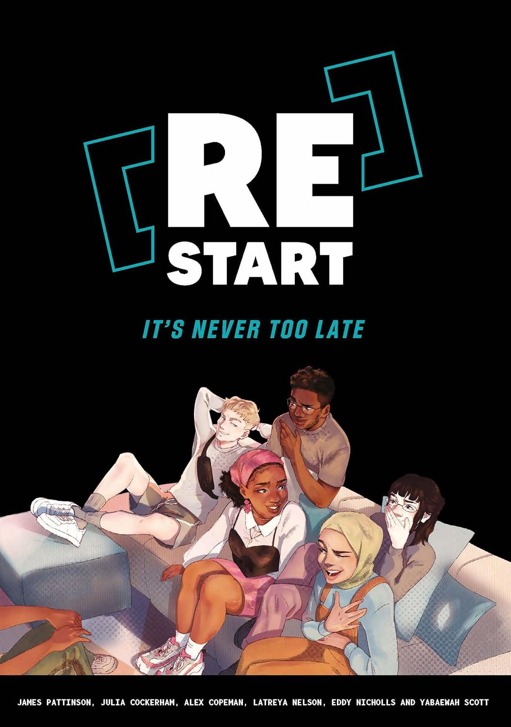
[Re]Start: It's Never Too Late is a narrative graphic novel and guided journal designed to help people on their life's journey.
Founded by a seasoned entrepreneur and co-created by young creatives from a range of backgrounds, this novel is a collaborative effort to compassionately guide readers into comfort, confidence and resilience.
Brief
Founded by a seasoned entrepreneur and co-created by young creatives from a range of backgrounds, this novel is a collaborative effort to compassionately guide readers into comfort, confidence and resilience.
Brief
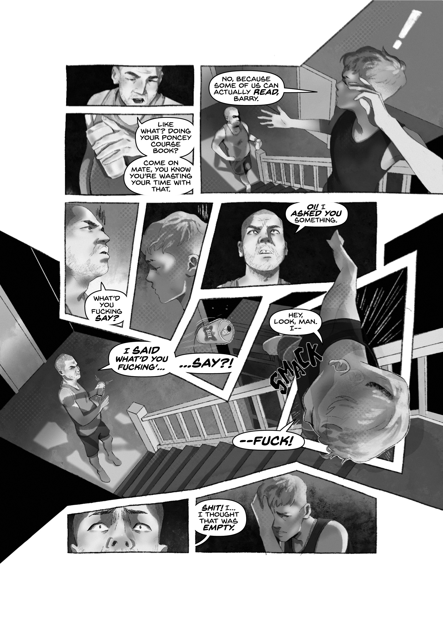
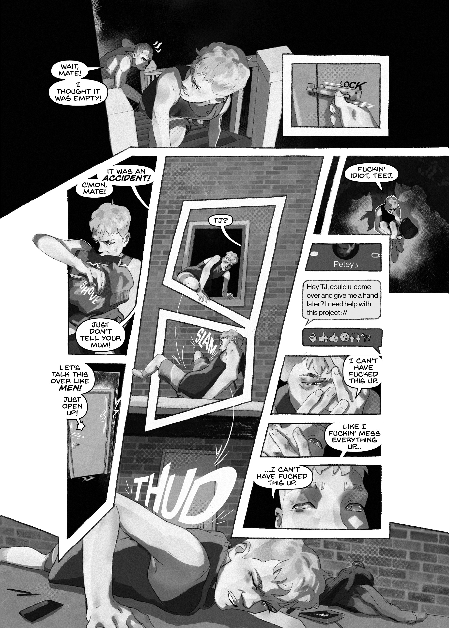
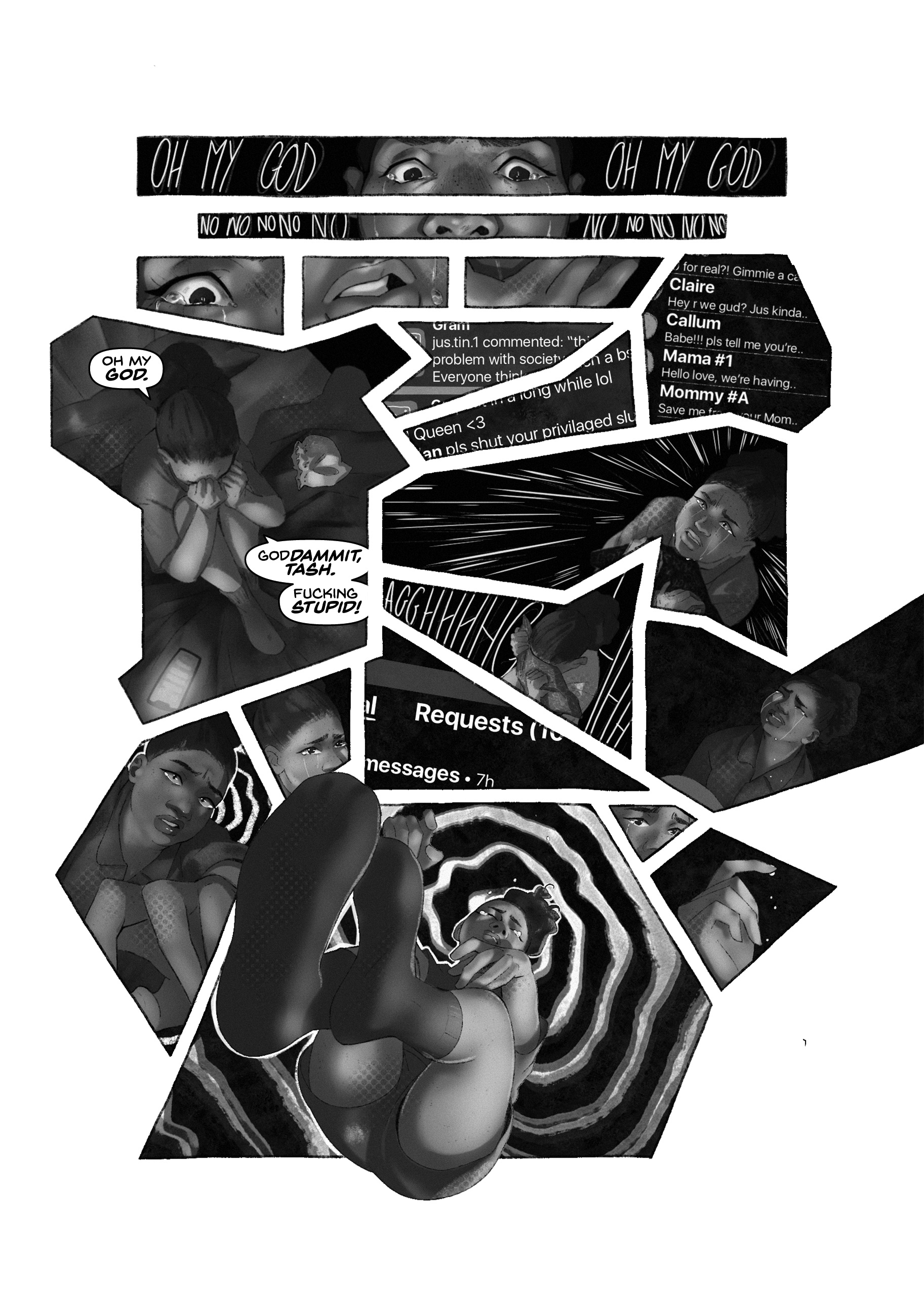
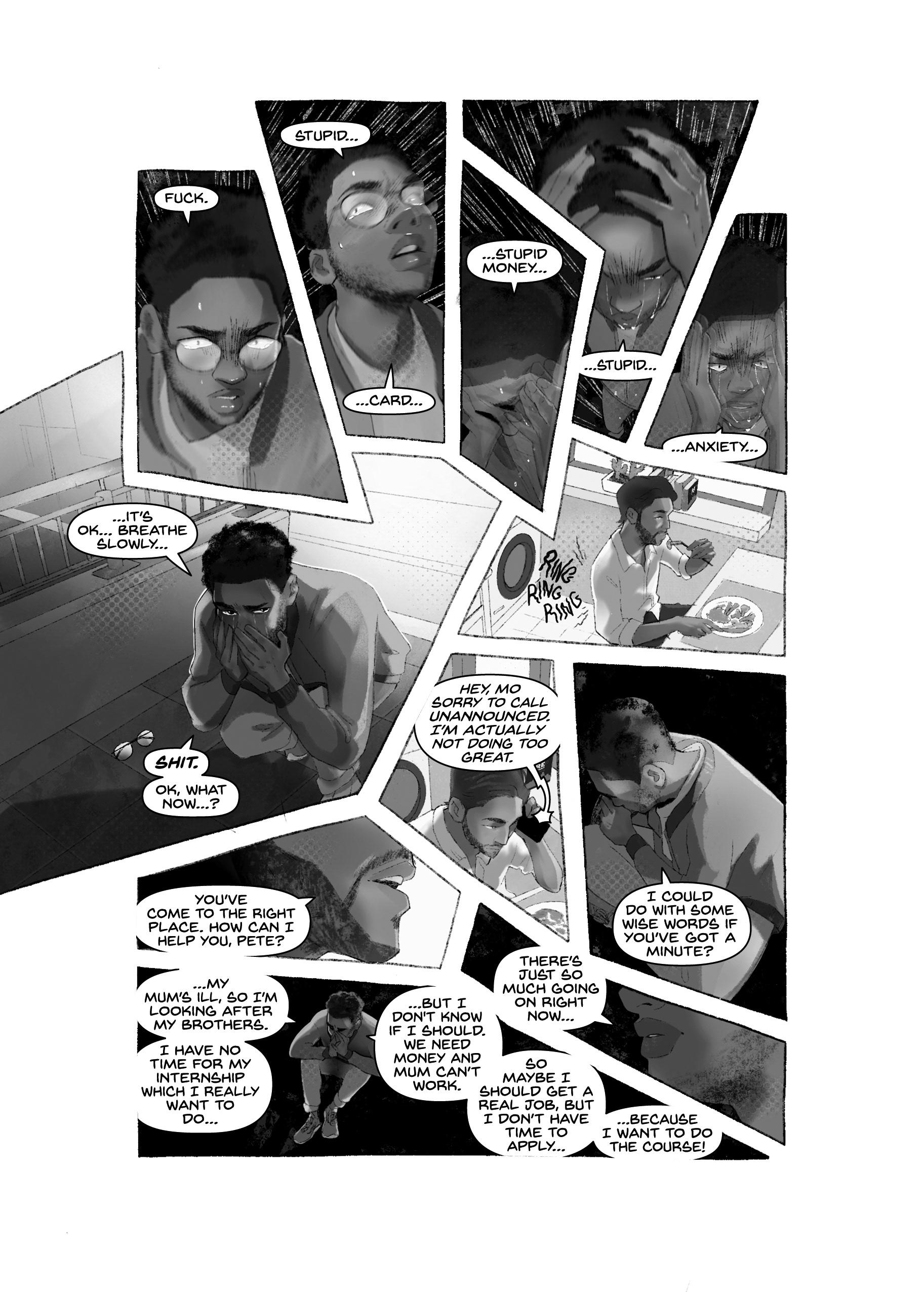
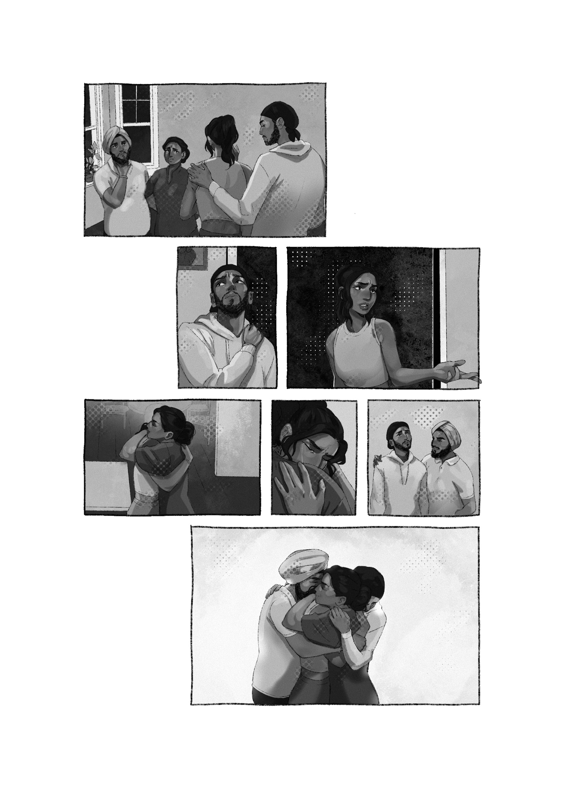
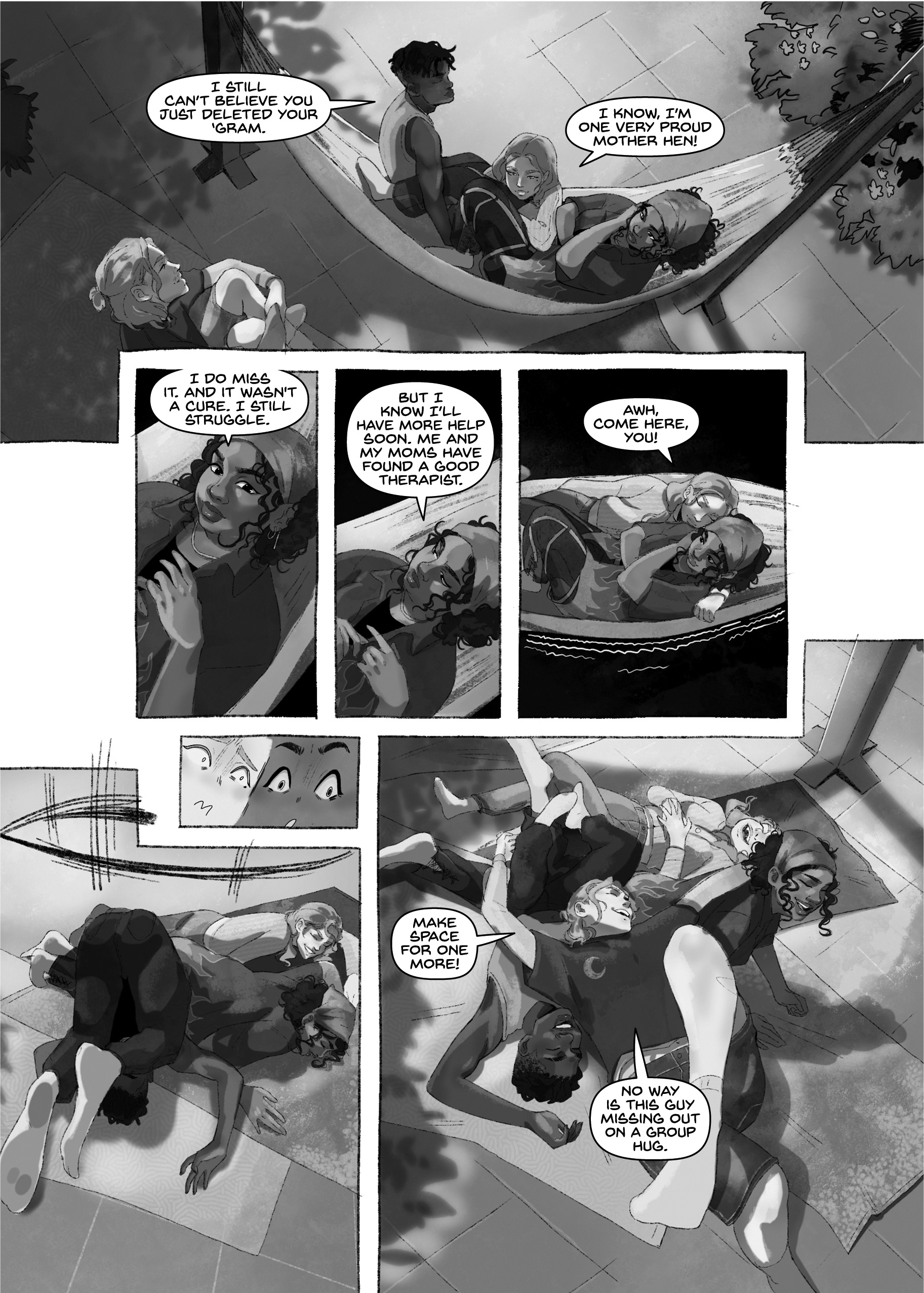
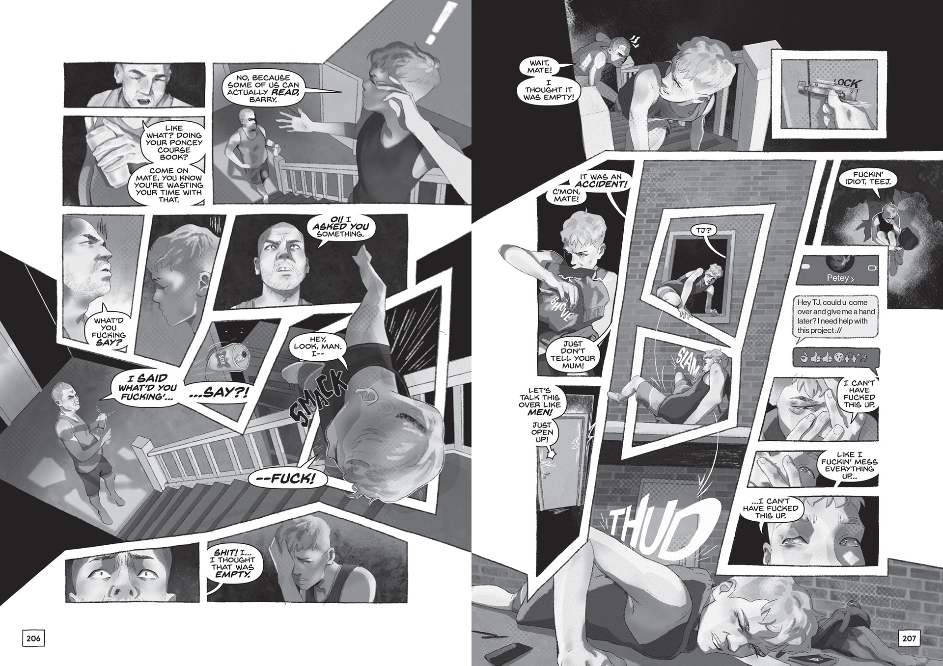
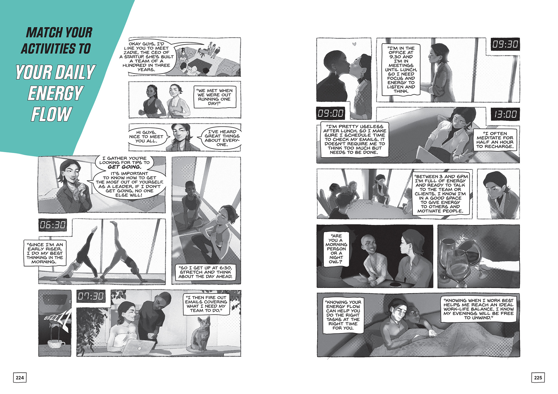
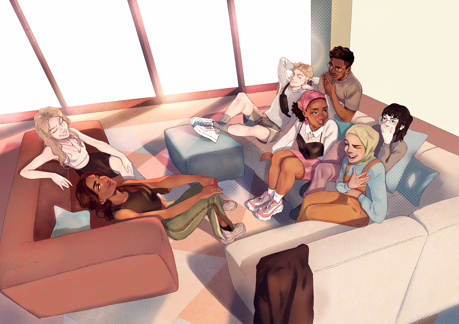
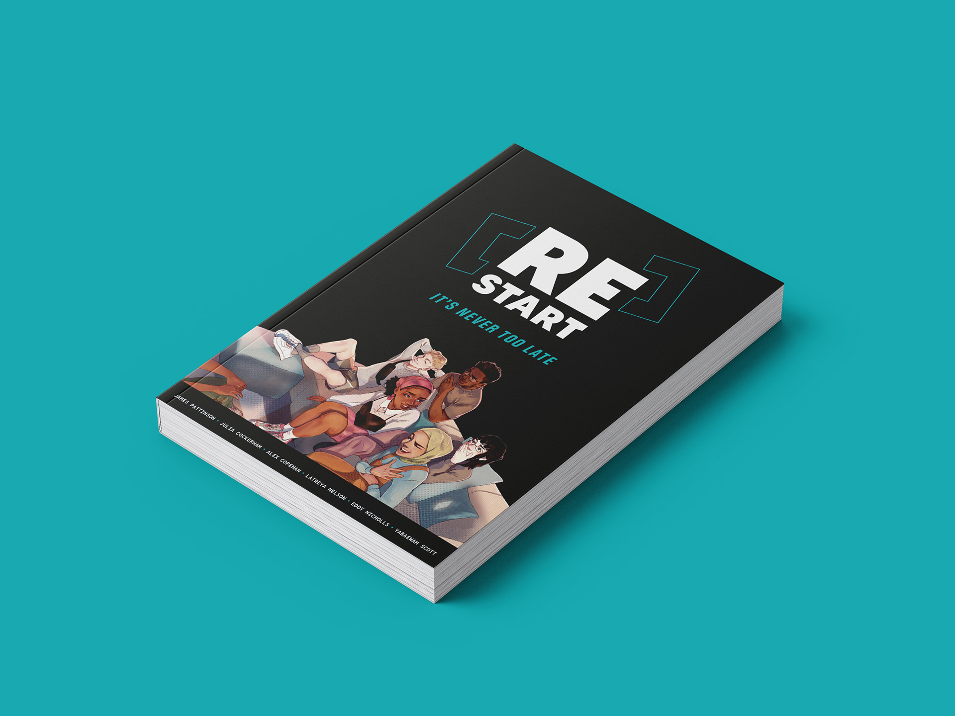
Andi, Pete, Priya, Sophie, Tash, TJ and Yasmin enrol onto the [Re]Start programme, and in six bite-sized chapters, learn how to manage the many obstacles they face. Andi grapples with anxiety, managing family expectations while studying alone in a new country. Pete struggles with caring for his ill mum and younger brothers while trying to secure a full-time job. Priya combats family expectations and responsibilities with her ambition to excel at university. Sophie feels like she doesn't fit in with her parents' or her friends' worlds. Tash struggles with her body image and social media presence. TJ struggles to cope in his dysfunctional family while managing college alongside his supermarket job. Yasmin feels guilty for chasing her dreams while remaining committed to her parents' sacrifices.
Our book shows through our seven young protagonists: it's never too late to start or restart your journey."
Our book shows through our seven young protagonists: it's never too late to start or restart your journey."
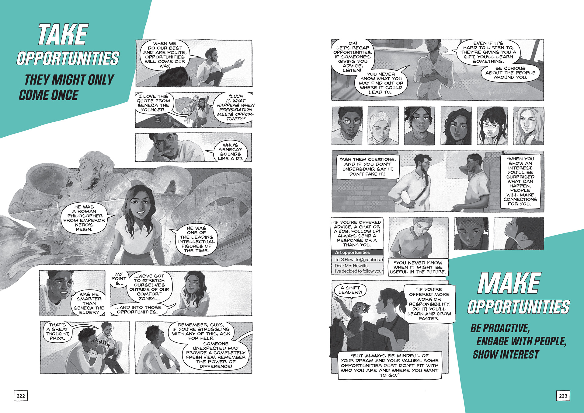
'This book is full of wonderful stories that give lessons for life, for self-confidence, for seizing opportunities, for finding your own way to the future. I’d give it to every young person like a shot.'
(Chris Smith, Master of Pembroke College, Cambridge and former Secretary for State for Culture, Media and Sport)
Page Artist, Cover Artist, Layout designer and Editor.
The book consists of 4 different artists', so we implemented layout and graphic guidelines that would help merge the styles throughout the book without removing each artists' voice.
Target Audience
Illustration
Focus on the age range of 16-24, the age range of those facing challenges post-COVID. However, the content should resonate with a broader demographic, emphasizing the message that it's never too late to start or restart
.
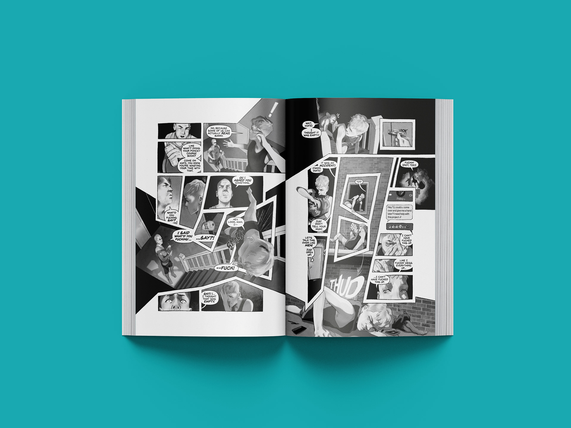
Four illustrators collaborated over a year, each separately being assigned a chapter to work on, while coming together to explore different perspectives while maintaining cohesion through visual guidelines and the black-and-white aesthetic.
Collaboration
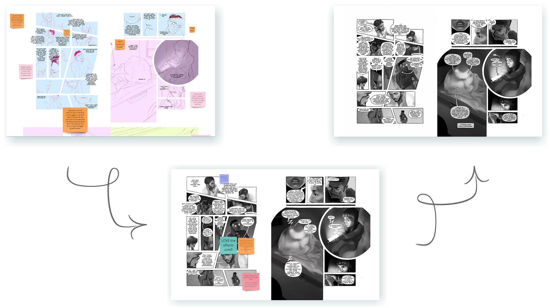
Creating this narrative remotely presented potential challenges, which was mitigated by leveraging the tools that emerged during the COVID era and maintaining a continuous flow of communication. Fortunately, the team were able to meet-up in person at the projects start, middle and end, creating robust relationships and establishing a foundation of trust.
Daily meetings were key for the illustrators, starting each day with discussions and maintaining a dedicated text chain for quick enquiries. The core team engaged in weekly critiques, showcasing the week’s progress with the primary goal of addressing and rectifying any mistakes before the weekend. In-addition, interactive whiteboards and group chats were employed to facilitate seamless communication with the broader team. This structured communication approach ensured cohesion and alignment throughout the project.
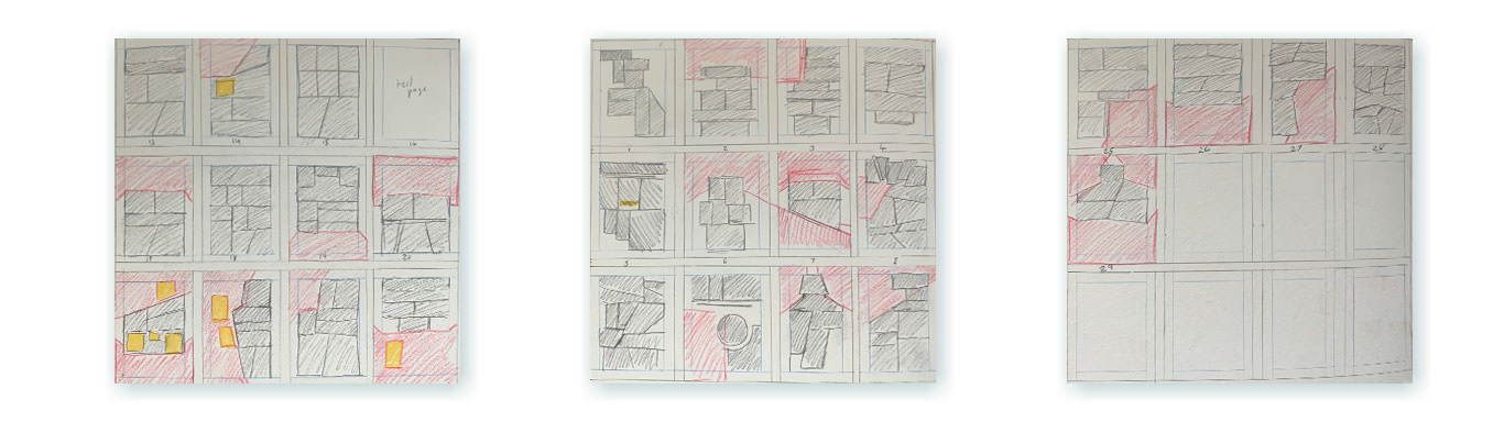
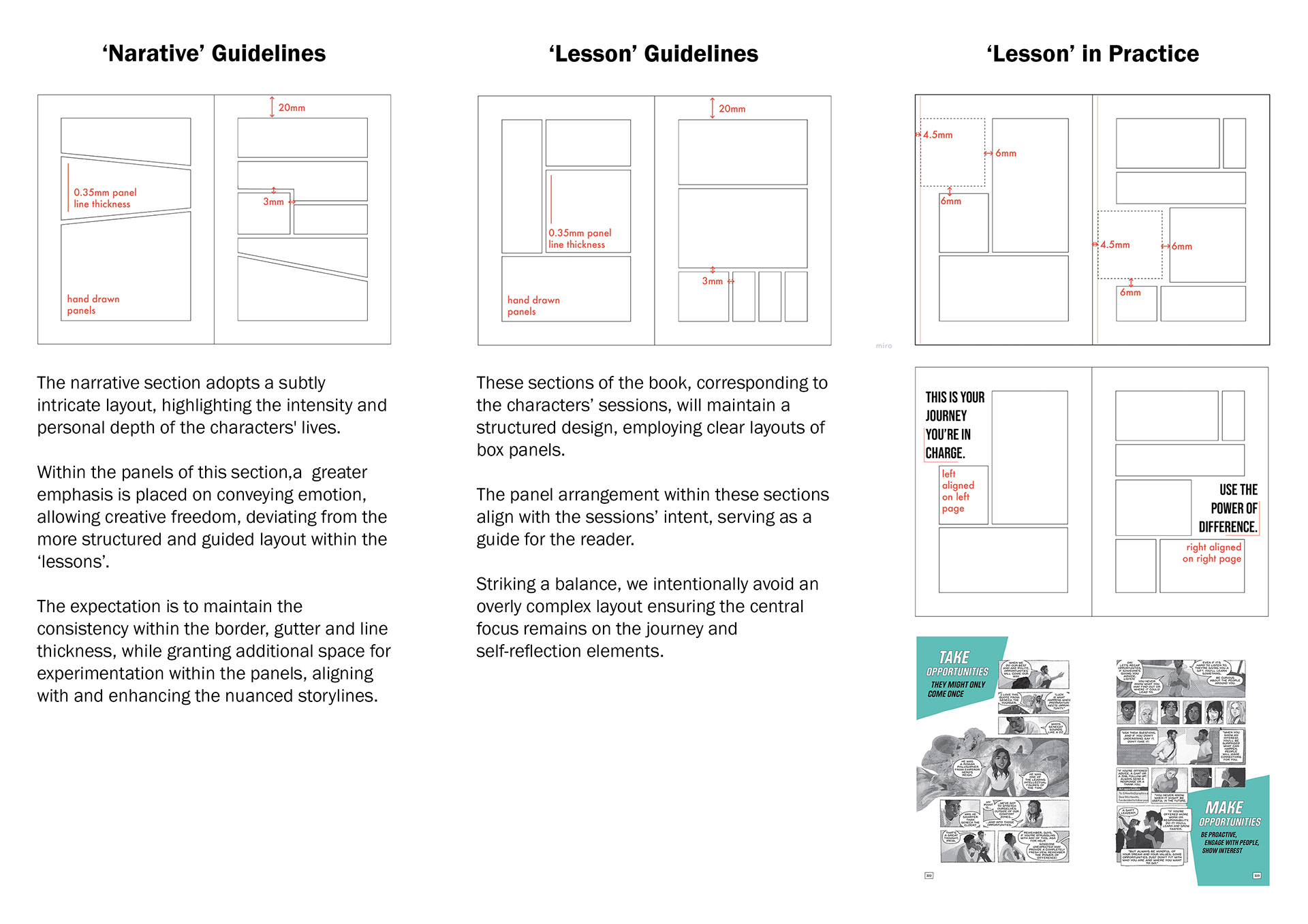
Layout
The pacing and presentation relied heavily on thoughtful page layout, with the team taking careful considerations into the gaps between panels to evoke specific tones and push the narrative rhythm. This helps to guide the readers through moments of action and contemplation while adhering to the design guidelines.
Colour Scheme
To focus on accessibility we had to balance the affordability of the final product without compromising on depth or quality, hence the decision to maintain a black-and-white palette. However due to this, branding would become an issue so we wanted to have a look at incorporating a secondary colour.
To do this, we deeply considered the tone, look and significance, going through an arrangement of iterations before landing on teal and pink. While the team at large enjoyed the visualisation of the novel using pink, this was eventually voted out, being later used on the limited edition copies covers as a nod to what could've been.
Teal was chosen, as it represents clarity of thought and revitalization, aligning with the novel's core message.
Design Guidelines
Design Elements
A cohesive approach was imperative to navigate a project with multiple creatives, so we set in place guidelines. The team adhered to a ‘bleed’ document, maintaining a 3mm gap between panels. The ‘lesson’ segments followed stricter guidelines, as we introduced more graphic elements to smoothly transition to the ‘journal’ segments.
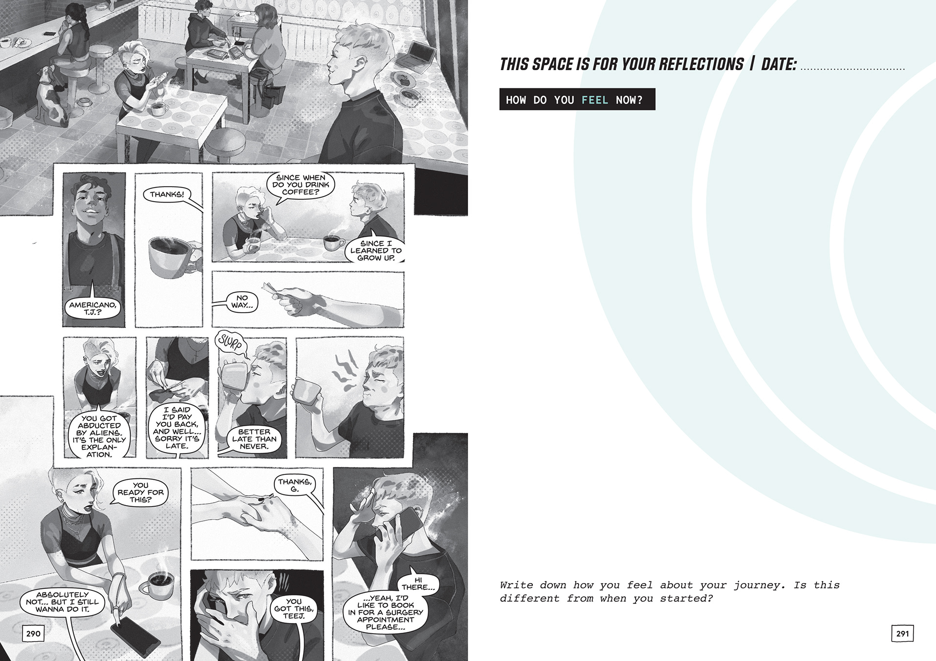
The shift from graphic novel to journal seamlessly occurs through the incorporation of graphic elements, which are derived from panel shapes to add a familiarity to the transition. The graphic elements host prompts, titles or questions directed to both the characters and the reader. Questions posed in the ‘lesson’ segments mirror those faced by the characters, creating synergy between the narrative and the reflective journal.
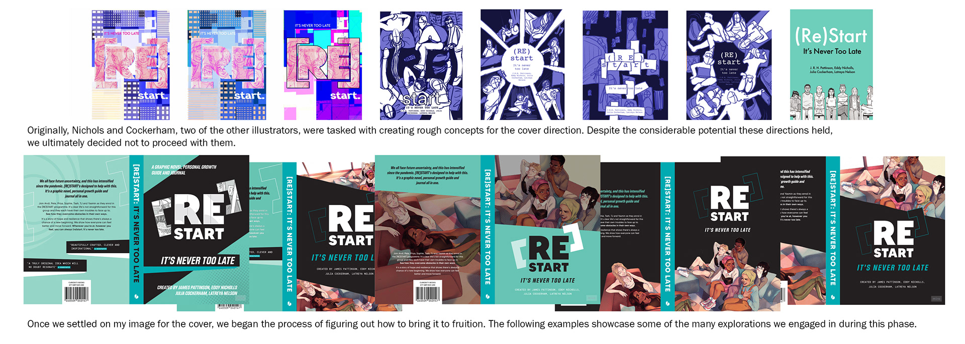
Cover
Initially a low-priority aspect, the cover naturally evolved after I was commissioned to create artwork of the seven characters, initially intended for postcards and promotional prints. Upon completion, this artwork was trialed as one of our cover options and garnered unanimous approval. Despite challenges converting an image intended for a different format, we settled on a wraparound cover with carefully considered negative space, resulting in a sleek, cohesive design, highlighting the chosen teal colour.